What Type of Motion Graphics Should You Use? A Breakdown with Real Examples

If you’ve spent any time online, chances are you’ve heard the term motion graphics. You’re not alone. In the past month, over 2,000 people searched for it on Google — a clear sign that more people are trying to understand what it actually means and how it’s used.
Now here’s where it gets interesting. Motion graphics and motion design often get lumped together, but they’re not quite the same. Motion design is the broader craft, a mix of animation, design, and storytelling. Motion graphics is one of the key styles within it, focused on bringing graphic elements to life.
And it’s not just animated text or floating icons. Motion graphics comes in many forms, each with its own purpose. From product demos to campaign assets, the type of motion graphics you use can change how your content lands.
So why are there so many types? And how do you choose the one that fits your brand?
Let’s break it down.
Why Are There So Many Types of Motion Graphics?
Okay, now picture as many brands as you can, go ahead, run through them in your head. Chances are, none of them share the exact same vibe, style, or identity. And that’s kind of the point. Not every brand speaks the same language, and not every platform plays by the same rules. That’s exactly why there are so many types of motion graphics.
Platform also plays a big role. A looping animation works great on Instagram, but would feel out of place on a product page. The format needs to fit where it lives.
You can see this in real examples. Netflix uses a short animated logo while content loads, setting the tone before the experience even starts. On our own homepage, we use Lottie-based looping animation to show who we are and how we work. Both are motion graphics, but they serve totally different purposes, and totally different style.
And let’s not forget the tools. We’re no longer stuck with frame-by-frame hand-drawn animation. With software like After Effects, Blender, and newer tools like Runway and Heygen, there’s more room than ever to experiment and push motion in new directions. If you're curious about the tools we use day-to-day, we broke it all down in our blog "What’s the Best Tools for Motion Design?".
8 Popular Types of Motion Graphics
Alright, let’s talk about the different types of motion graphics.
This isn’t a ranked list. Each style has its own use depending on your brand, your platform, and what you’re trying to say. There are tons of styles out there, but we’re keeping it simple and focusing on eight that are easy to recognize. We’ve also added real-world examples for each one to help you know which one you want for your brand.
If you're trying to figure out which style fits your content, this is a solid place to start. Let’s get into it.
1. 3D Animation
What it is:
This kind of animation brings in all the good stuff: depth, lighting, and realism. It looks super clean and polished, like something you'd see in a product launch or a premium brand ad.
A lot of SaaS and tech companies lean into this style because it gives off that modern, high-end vibe. It's also perfect when your product isn't physical or isn't ready to film yet. Instead of waiting around for a prototype, 3D animation lets you showcase the experience visually, even if it's still in development.
Where it shows up:
Tech brands, architecture, engineering, medical visuals, product explainers — anywhere you need to show something with detail and impact.
- Best for: Physical product demos, sleek promos, or brands that want a premium look.
- Avoid for: Fast-turnaround content or social ads where budget and time are tight.
2. 2D Animation
What it is:
2D animation is super clean, super flexible, and still one of the go-to styles out there. You’ve probably seen it in explainer videos, brand stories, or onboarding content, and that’s because it just works.
A lot of teams pick 2D because it’s faster to produce and way easier on the budget. If you need motion design but don’t have a ton of time or cash to throw at it, this is the move. And if things change later? No stress. It’s easy to update and reuse without starting from scratch.
Where it shows up:
SaaS explainers, onboarding videos, educational content, internal comms, brand storytelling.
- Best for: Breaking down ideas, quick production cycles, or when you need to stay flexible.
- Avoid for: Projects that need realism or lots of visual depth.
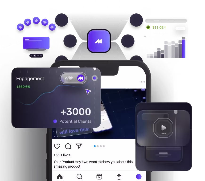
3. UI Animation
What it is:
UI animation is all about bringing digital interfaces to life. It doesn't just show what your product does. It shows how it works. Those little transitions and micro-movements make everything feel smoother and easier to follow.
But it's not just about function. UI animation also adds personality to your product. Even something as simple as a hover effect or a click animation can set the tone. Whether you want your brand to feel playful, polished, or premium, those small motions help shape that vibe. It's a subtle detail that makes your product feel more intentional and on-brand.
Where it shows up:
App demos, UX walkthroughs, SaaS landing pages, product teasers, pitch decks.
- Best for: Showing user journeys, explaining features, and adding clarity.
- Avoid for: Storytelling-heavy content or stuff where personality matters more than function.
4. Logo Animation
What it is:
Logo animation is one of those small things that makes a big difference. It’s how you bring your brand mark to life, whether it’s a slick reveal, a looping moment, or something a little playful. That first second matters, and motion sets the vibe right away. It gives your logo energy, makes it feel intentional, and helps your brand stand out without saying a word.
People use logo animation because it adds polish and personality without overcomplicating anything. It makes your brand feel modern and memorable. Whether it shows up at the start of a video, on a splash screen, or in a pitch deck, a moving logo tells people you actually care about the details. And that matters.
Where it shows up:
YouTube intros, sizzle reels, product pages, decks, and literally any branded video.
- Best for: Creating a strong first impression and making your brand feel more dynamic.
- Avoid for: Content where the logo isn’t playing a key role, or when visuals need to do the heavy lifting.
5. Character Animation
What it is:
Character animation is all about making things feel more human. Instead of just showing features or facts, you’re bringing in a little personality, someone the audience can actually connect with. Whether it’s a friendly guide, a quirky mascot, or a stylized figure that walks people through something, characters help make your message hit on a more emotional level.
Brands use character animation because it works. It grabs attention, tells a story, and makes the content way more fun to watch. It’s perfect for stuff like explainer videos, onboarding, or anything that needs a little extra heart. When people see a character, they stop scrolling and start paying attention.
Where it shows up:
HR videos, internal comms, healthcare explainers, education content — anywhere empathy matters.
- Best for: Making content feel relatable, adding personality, or simplifying complex topics.
- Avoid for: Tight budgets, short timelines, or projects that don’t need that extra emotional layer.
6. Kinetic Typography
What it is:
Kinetic typography is basically animated text with energy. It’s not just about making words move around. It’s about making them feel alive. When the timing is on point and the motion matches the message, even simple words can hit way harder.
People use it because it’s bold, clean, and gets straight to the point. You don’t need fancy visuals. Just good copy, smart animation, and the right pacing. It’s perfect for grabbing attention, adding rhythm, or making a message stick without overcomplicating the design.
Where it shows up:
Social ads, music videos, event visuals, promos, brand awareness pieces.
- Best for: Bold messaging, fast-paced content, and keeping things visually tight without over designing.
- Avoid for: Projects that rely more on visuals than words — too much type can feel heavy
7. Animated Graphic Loop
Loop animation is all about subtle, repeating motion that plays seamlessly without a clear start or end. It’s the kind of animation that just keeps going, which makes it perfect for catching attention without being distracting.
People use loop animations because they’re great for adding life to content. You’ll see them in social posts, websites, app screens, or backgrounds — anywhere you want a little motion to keep things engaging. They’re light, versatile, and super useful when you want movement that feels intentional but doesn’t steal the spotlight.
Where it shows up:
Social posts, story backgrounds, loading screens, Reels, websites, app animations.
- Best for: Creating motion without needing a full story — perfect for ambient visuals or looping engagement.
- Avoid for: Narrative or goal-driven content. Loops are great for vibe, not deep messaging.
8. Product Animation
What it is:
Product animation is basically the best way to show off what your thing actually does. Instead of filming it or trying to explain everything with words, you just animate it. You can spin it, break it apart, zoom in on the cool stuff, whatever helps people to understand your product.
Brands use this style because it makes the product look clean and easy to understand. It’s perfect for launches, landing pages, or even quick social posts. And if your product’s still in development? No problem. You don’t need a physical version to start building hype. Just animate the concept and let the visuals do the talking.
Where it shows up:
E-commerce, landing pages, demos, explainer videos, sales decks
- Best for: Showcasing features, simplifying tech, replacing live shoots
- Avoid for: High-concept content or brand-level campaigns
What Style Is Right for Your Brand?
Alright, now that you’ve seen a bunch of different motion graphic styles, you might be feeling a little overwhelmed. All the options sound great, but how do you actually choose?
So... how do I know which style is best for my brand?
The answer really depends on your goals, your audience, and your resources. There’s no one-size-fits-all. But here are a few questions that can help you figure it out before you lock in a direction:
- Does the style align with your brand’s identity and visual tone?
- Does it support the goal of the content, are you trying to explain something, promote a product, or build awareness? Or do you have other goal?
- What’s your budget and timeline? Some styles take longer or require more people to pull off.
- Who’s your audience, and how do they like to engage with content? A B2B viewer on LinkedIn and a Gen Z audience on TikTok won’t respond to the same thing.
- And lastly, is the style realistic for your team to produce? Not just creatively, but in terms of skill set, tools, and workflow. If not, do you have creative partner that could bring your vision into reality?
Once you have a clear answer to all of this question. than you can find a style that fits with your answers!
Conclusion
It’s hard to imagine a brand today that doesn’t use motion graphics in some way, even the most basic ones. And when you look around, no two animations really feel the same. That’s because there’s no one-size-fits-all solution. Different brands need different vibes. Even within one company, one project might need something totally different from the next.
Choosing the right style can help boost your brand presence and create a better experience for your audience. If you’ve got a project in mind but you’re not sure which type fits best, let’s talk. Book a call with us and we’ll help you figure it out. Or if you want to explore on your own first, feel free to browse our services and see what we can do.

table of content
creative brief
Want to know the cost of your next video? ✨
Answer a few quick questions and get an instant estimate tailored to your project goals. It’s fast, free, and personalized just for you.


Contact Us
Ready to elevate your brand? Contact us for your
Free Custom Video Sample